A ‘before and afters’ renovation has got to be one of our favourite things to showcase in our blogs. There’s nothing like seeing a space completely transform from something mediocre to something amazing. And this one’s a great example!
Our recent clients project was an interesting concept. Being a home-builder they were wanting to showcase their available finishes and options in a neat and stylish manner.
The brief was to ‘create a space that makes clients excited about their new build journey’. To have finishes and options readily available without feeling claustrophobic’.
It was important to create a journey which takes their client through the front door and allows them to imagine their own home.
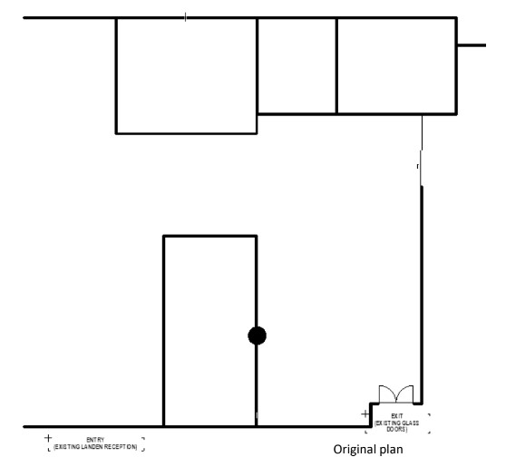
Before
The before space was an empty shell with a fire exit door that had to remain in situ and part of a column that obviously could not be moved. Another key issue was the sliding door into the adjacent office. The space was limited in size but had to have the ability to display several bathroom and kitchen options, external and internal elements, including the kitchen sink.
The Design Process
Once we had a good idea of what was required we set out to redesign their space to achieve the clients goals. Taking into consideration practicality, functionality and aesthetics we drew up a new exciting floor plan.
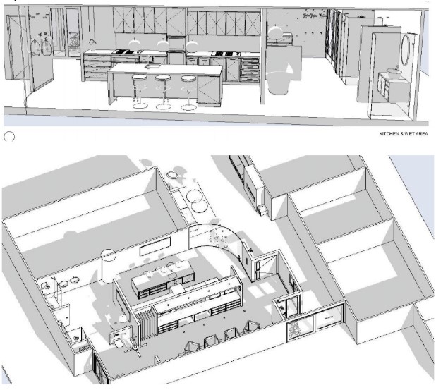
The plan below was the final selection after constant evaluation and tweaking. What we managed to fit into this space was amazing and a testament to the hard work of the team, lots of measurements, specifications researched, and clever spatial planning.

To achieve all the clients requirements we needed to utilise some of the space that housed the large sliding door. In order to overcome this constraint, we flipped the door and had it opening the opposite way. This allowed the fixed panel to become a threshold and space for the Zen Garden which is a key feature of North Homes designs.
To circumvent a tight space between the waiting area and walkway to the offices we curved the wall. This softened the appearance and helped to create a sense of wow. For each step of the way we provided North Homes with 3D drawings and elevations so they could easily imagine the end result and be able to cross reference that all storage and display requirements were met.
Progress Shots

The Display Suite
This space was a very small area, so we had to devise solutions to showcase all the products and materials without it looking messy and overcrowded. Different areas displaying product inclusions and options for sections of a new build were required. All materials used in this space were options available for clients to select for their new home.
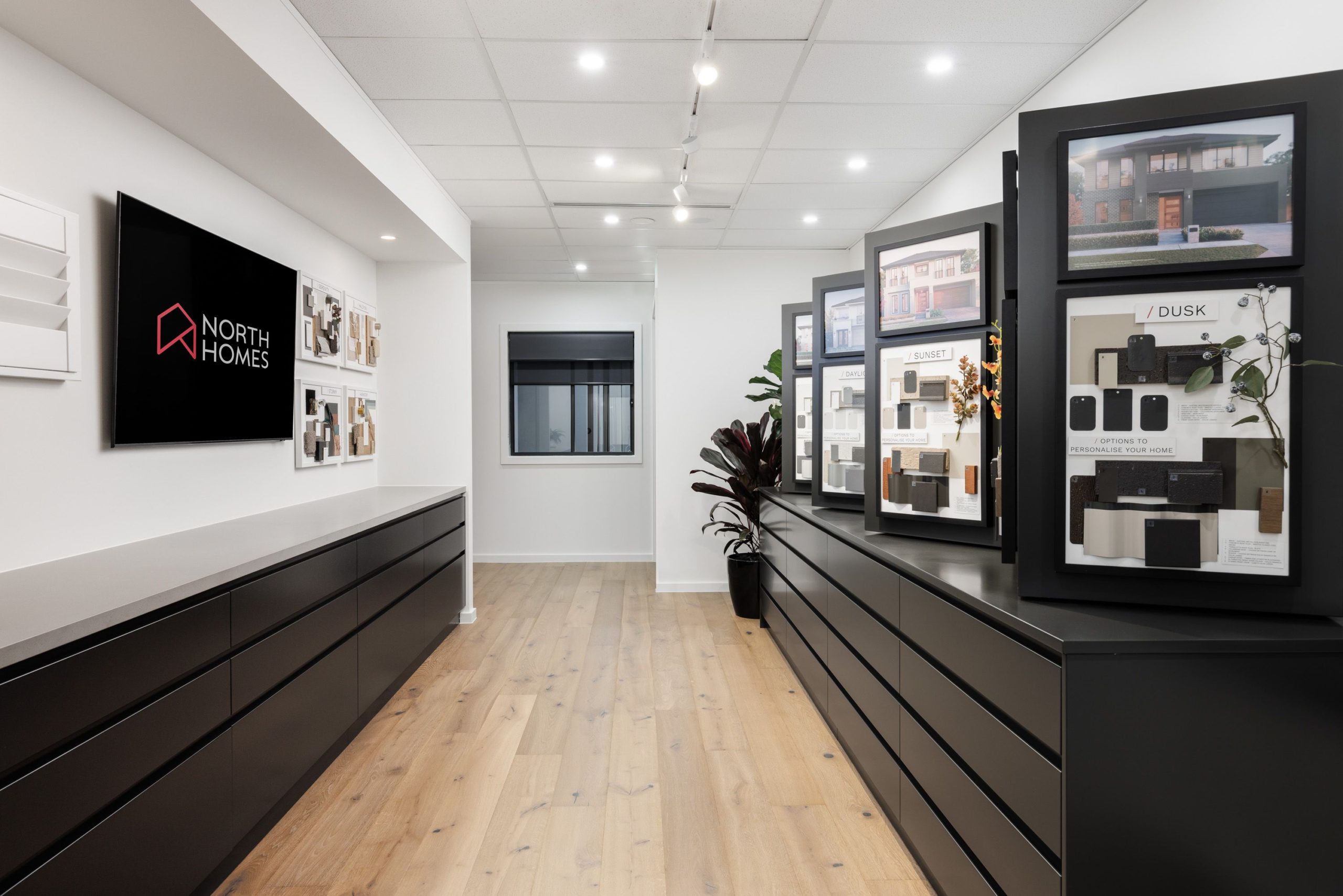
To create a logical progression throughout the display centre, it was broken into zones starting with the external selections after the client walks through the amazing front door.
The entry lights, door handles again, are all options available for selection. Through to flooring and door options, then the wet areas, kitchens, and lighting. Essential items such as light switches, GPO’s, alarms, the not so pretty things but necessary for a fully functioning home were also included.
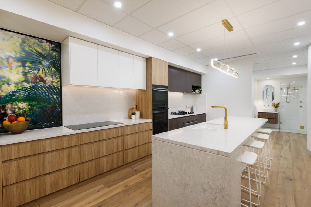
The kitchen zone showcases all the inclusions as well as an under-bench oven, gas and electric cooktops, tower, and range hoods. Polyurethane and laminate options are all on display.
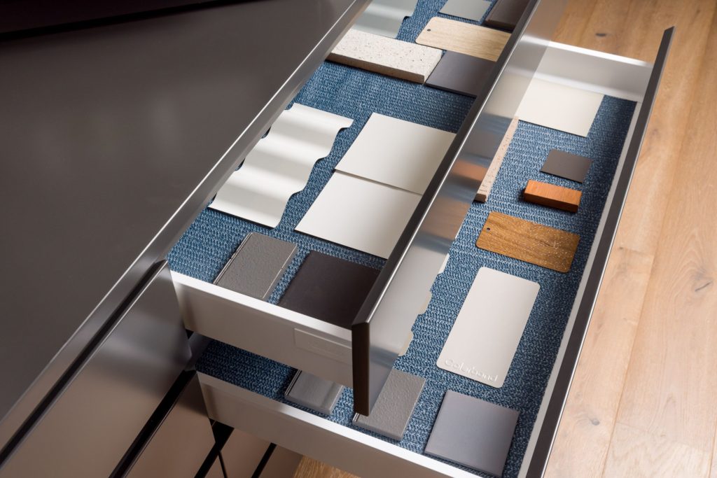
The inclusions such as sink options and drawer inserts were displayed in easy to pullout drawers and a pendant light highlighted the island bench with its upgraded engineered stone and fluted façade. This area also showcased the pendant lights available in their contracts available for selection, every taste being catered for, from your classic French Provincial through to contemporary styles.
Other display areas showcased options such as flooring and lighting options, built in cisterns, tile layouts, internal colours and tapware choices and colours. As well as cabinetry styles such as shaker profiles and flat panel.
FREE DOWNLOAD!
Get our Kitchen Design Guidelines to help you with your planning and renovation.
Bathrooms
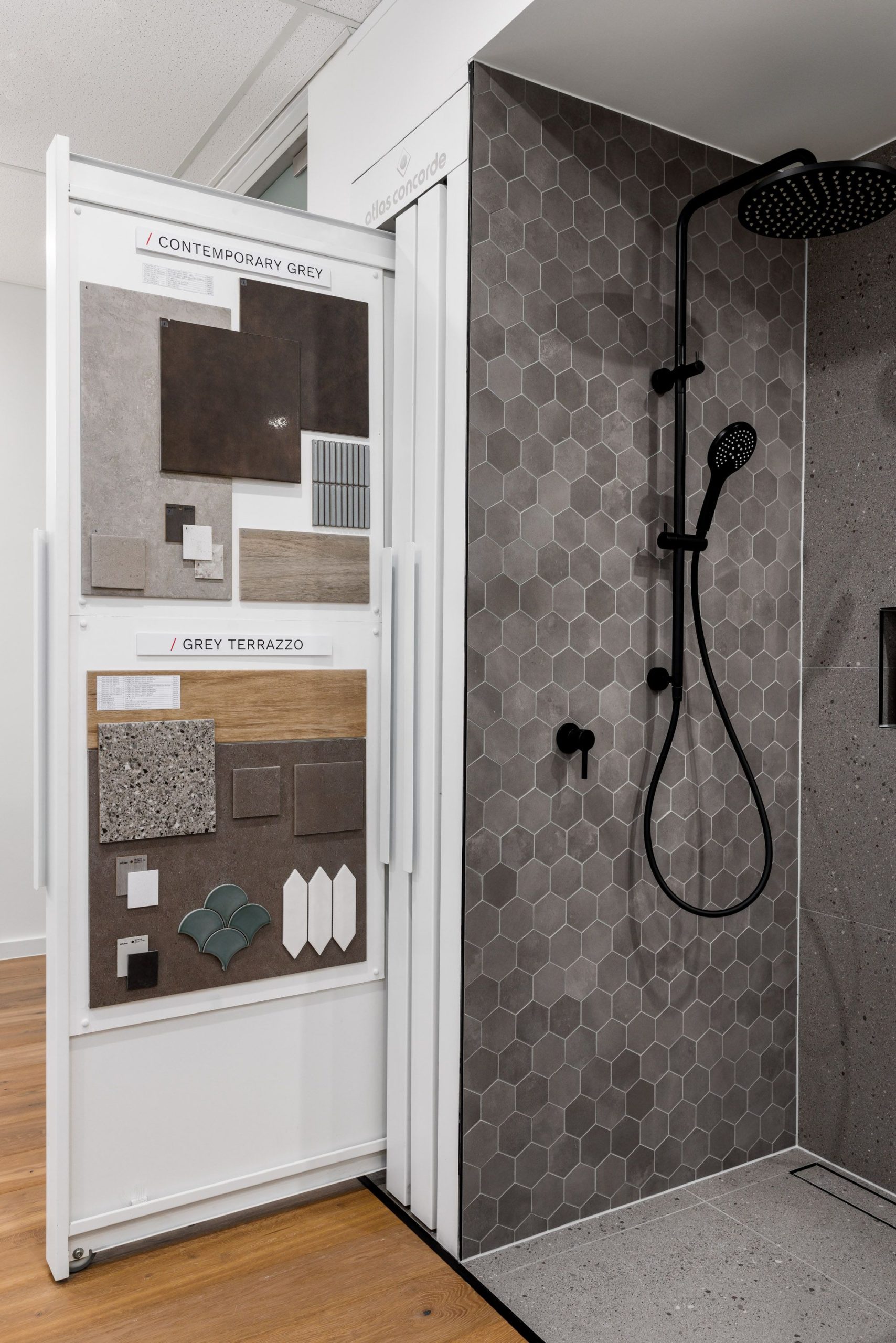
The bathroom zones were to showcase both a light and dark colour palette, as well as with or without a bath. These examples show one with soft curves, warm timber, gold tapware and crisp whites and the other with cool greys, monochromatic with sleek black tapware clean lines. Different looks but both aesthetically pleasing and functional. Built in niches, dwarf walls, free standing bath, wall hung units were all displayed. Tile options demonstrated herringbone patterns, brick lay, hexagon feature tiles and marble look option
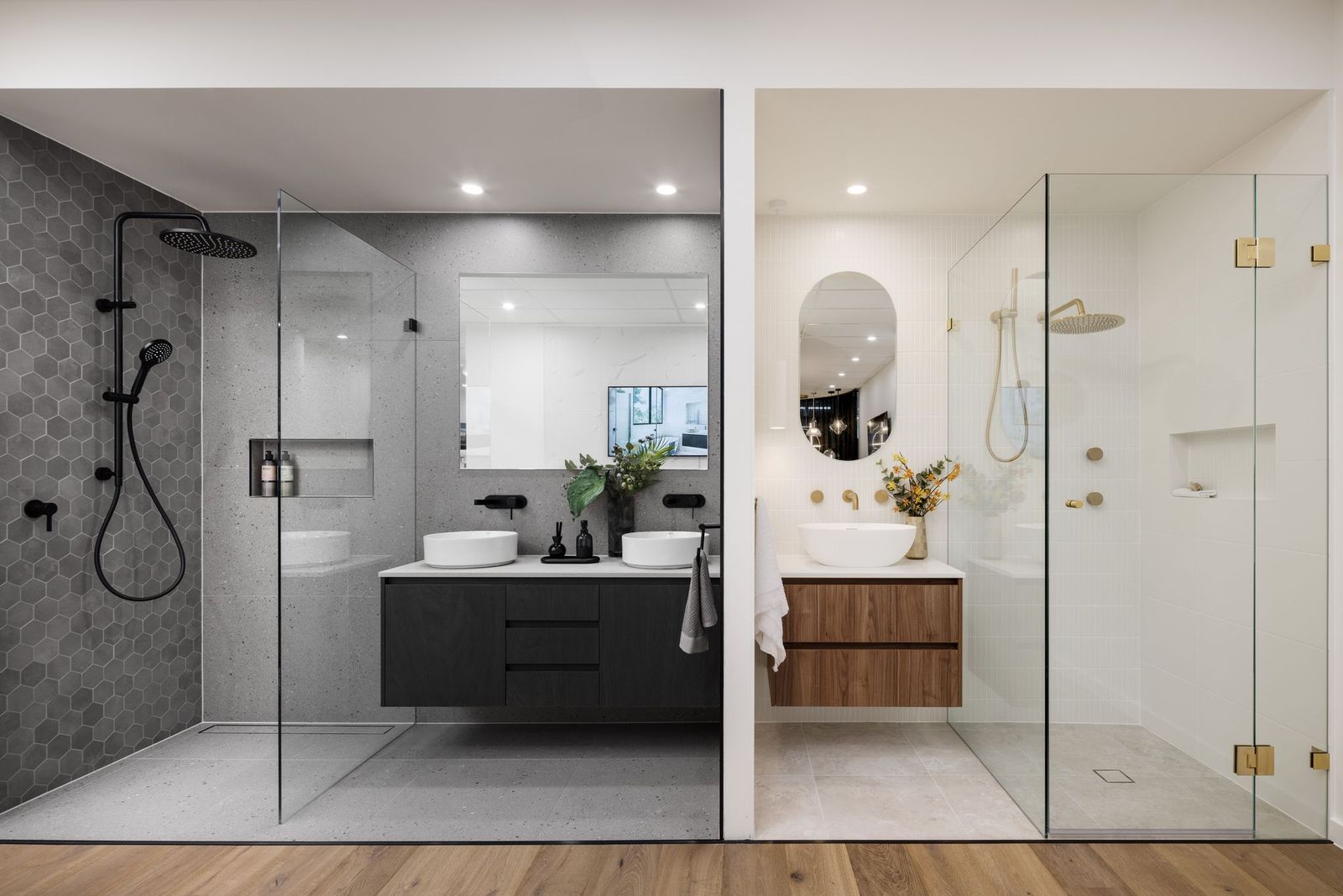

To conserve space the tiles options were housed in specially designed pull out units. When not in use the units were neatly stacked away. This concept was also used for both internal and external doors.
Exterior Options
We were asked to select external finishes but retain the same window colour and roof colour. This was for both the standard inclusions as well as the upgrade options.
The finishes and colour palettes were to be within a certain budget constraint and include both standard and upgrade options.
External colour palettes were represented on rotating units, to circumvent the issue of many façade options requiring display. So, if the client selected a French provincial style home, all façade combinations can be rotated and displayed at the same time. This making it easier for the client to compare and make selections.
The display units were in a dark colour in order not to distract from facade options available for selection. Samples of each facade colour palette were hidden away in drawers under the rotating units for easy access and viewing.
The actual specification of all finishes and facades was a culmination of hours of work. These hours spent between Austral bricks, North Home offices and our office space.
Ensuring associated cement render colours would work in all external aspects was a demanding job. We collected samples of bricks, roof tiles, windows & cement render. Then checked them in both sunlight and shade, in inclement weather, and very sunny weather.
Evaluating Options
The samples were laid out in North Homes office for several weeks. This was in order to evaluate the options and gather feedback to ensure that every element worked.
This was an enormous team effort by both Inspired Spaces and North Homes. Estimators ensuring our selections were cost effective with reliable availability. Drafts people double checking if any design considerations needed to be addressed. And the operations department double checking the recommended finishes meet Australian Standards and Building Codes.
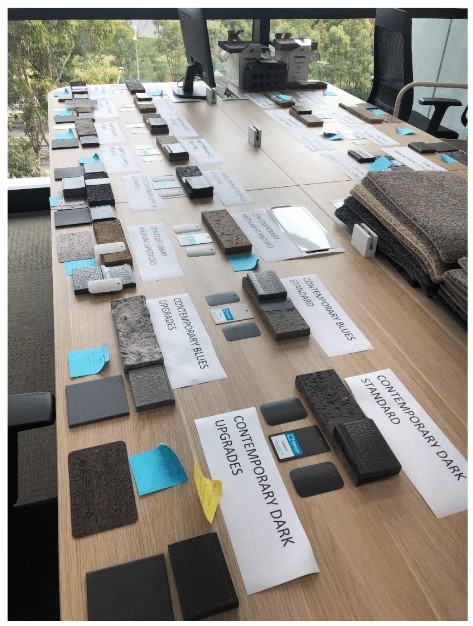

This entire process was repeated with internal finishes. We spent several days at Abruzzo Tiles playing with tiles and cabinet finishes. We worked with options for standard inclusions and upgrades. They were displayed on flat lays and samples stored in large, pull-out drawers. These drawers providing easy access to give clients a quick visual to help with their decision making.


Marketing Collateral
We also created the inspirational flat lays for promotion and marketing purposes.
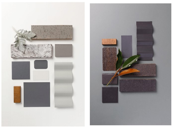
As such, these boards required different compositions and not all materials were necessary for the images. Precise positioning was required for the photographer to take these amazing shots. Scale of each element was vital. We were often constrained by sizes and shapes of samples. Quite a few of which could not be modified, making the task even more difficult.

The waiting area was designed to emulate a client’s new lounge room. This design provides a beautiful, relaxing space for the client while they are waiting. It also evokes feelings and ideas of what they may want in their new home. North Homes also is offering options for joinery updates and this is showcased in the waiting area.
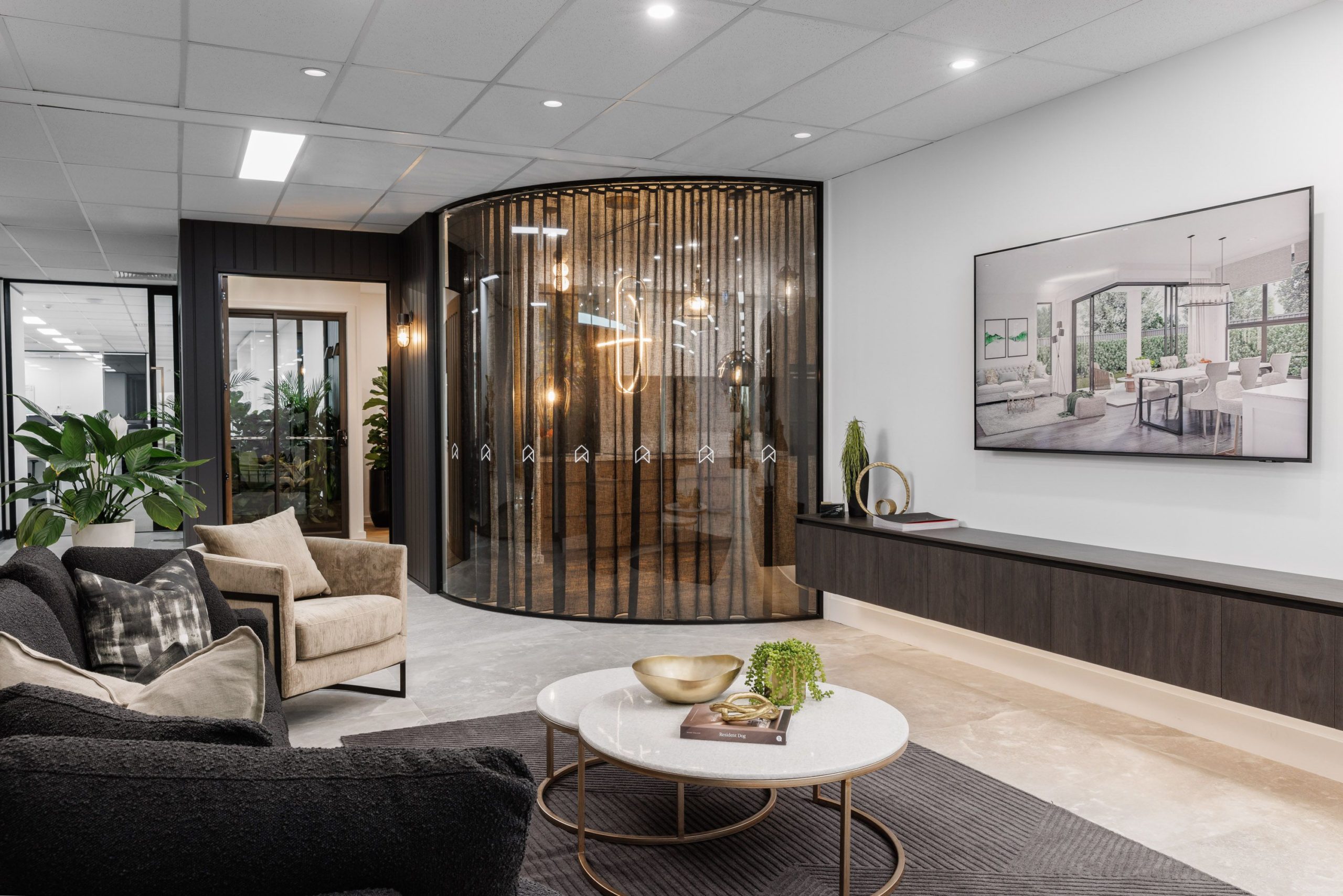
We’re very proud to have designed every aspect of this Colour Selection Studio. This includes every working part of the display unit and all joinery. All colours, finishes and styling throughout display area and lounge were selected, specified and completed by us at Inspired Spaces.

Book a 15-Minute FREE Discovery Call
Need help or advice regarding any residential or commercial design or decorating projects? Get your FREE 15-minute discussion with Robyn!


Leave A Comment Or Ask A Question