Kitchen Colour Trends – How do I select colours for my kitchen
Summary:
- Common kitchen colour mistakes include ignoring mood, lighting, and space. Choose colours based on the atmosphere you want, the amount of natural light, and whether your kitchen is small or large. Light tones expand small spaces, while darker hues add depth to larger kitchens.
- Kitchen colour trends for 2025 favour muted greens, dark and moody tones, earthy browns, and bold natural stone features. Textured whites are replacing glossy finishes, and timber-look laminates like Polytec Prime Oak are popular for adding warmth and contrast.
- Tapware and finishes are shifting from chrome to warmer metallics like brass, bronze, and gold. These finishes complement today’s warmer, cocooning colour palettes and help elevate the look of both modern and classic kitchen styles.
Choosing the right colour scheme for your kitchen involves balancing aesthetics, functionality, and personal style. Here are some tips to guide you:
1. Consider the Mood You Want to Create
- Warm Colours: Shades like red, yellow, and orange create an inviting and lively atmosphere, ideal for kitchens that serve as social hubs. Red stimulates appetite, while yellow brings cheerfulness and brightness –
- Cool Colours: Blues and greens offer a calming effect, perfect for tranquil spaces. Green evokes nature and freshness, making it a great choice for food preparation areas link to psychology of colour.
2. Adapt to Your Kitchen’s Size
- Small Kitchens: Light colours such as white, beige, or light grey reflect light and make the space feel larger and more open. Adding subtle accent colours can bring personality without overwhelming the room. However, some spaces no matter what design tricks you employ will always look small so in these cases go for drama
- Large Kitchens: Darker shades like navy blue, dark green, or charcoal create a cosy and luxurious feel. Pair them with lighter accents to maintain balance
3. Match Your Kitchens Style
- Modern Kitchens: Neutral tones like white, grey, and black work well for minimalist designs. Stainless steel details can enhance the sleek look
- Country Kitchens: Earthy tones such as olive green, sand, or terracotta complement natural materials like wood and ceramics for a warm, rustic vibe.
- Retro Kitchens: Bold colours like yellow, blue, or green add playful energy. Combine them with chrome or patterned surfaces for authenticity.
FREE DOWNLOAD!
Get our Kitchen Design Guidelines to help you with your planning and renovation.
4. Use the 60-30-10 Rule
This design principle helps balance colours:
- 60% Dominant Colour: Typically used for cabinetry or walls.
- 30% Secondary Colour: Adds contrast or complements the dominant shade.
- 10% Accent Colour: Used in smaller details like backsplashes or decor items to add personality.
5. Consider Lighting
Natural light influences how colours appear in your kitchen:
- If your kitchen lacks natural light, opt for lighter shades to brighten the space.
- In well-lit kitchens, darker tones can create depth and sophistication.
7. Coordinate With Adjacent Spaces
For open-plan homes, maintain a cohesive color theme between the kitchen and nearby rooms to create a unified look.
Kitchen Colour Trends
Bold, confident and vibrant are the trends this year. Check out the Smeg Dolce and Gabbana range and their retro fridge and appliance ranges.

Muted Greens
This is one of the most common colour this year, a classic combination is Polytec Oasis paired with Prime Oak Woodmatt.

Greens range from olive to deep greens to teals. There is a tendency to go more muted paired with tapware such as brushed brass, bronze or nickel.
Dark and Moody
Deep blues, charcoal, even black generally paired with lighter bench tops are currently a popular kitchen colour trend.
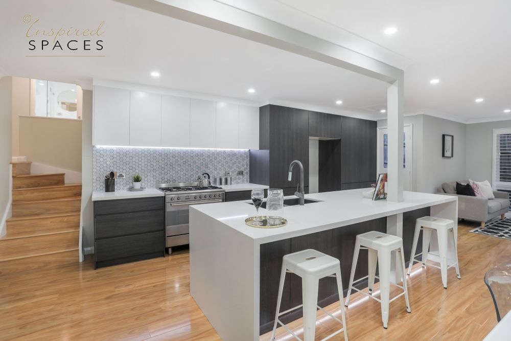
This palette is a perfect canvas for pattern, texture and metallic accessories- tapware can be anything from Chrome to Champagne, Brass, Nickel and Bronze add colour samples from Dulux
Warm Earthy Brown And Red Tones
We are not talking seventies mission brown era but the muted browns such as Dulux Namadji ,Toffee Fingers or Tapestry Beige. They are often paired with off white benchtops or even white for a great contrast.

Bold Natural Stone Features
Natural stones with bold and strong patterns are emerging as favourites. The green Verde Alpi is stunning and can be used as a feature on splashbacks or islands or the entire kitchen –

For those not game for the strength of Verde Alpi then Aurora Quartzite might be up your alley. The mixture of pastel green, grey and white creates a perfect artwork.
Pink marble/quartzite is making a comeback and look stunning with the gold/brass undertone tapware.
For those who do not want the maintenance of natural stones, there are alternatives such as porcelain, silica free mineral benchtops that have a huge range of options that emulate the real thing. One of my favourites is the sintered stone Vagli Gold from Talostone.

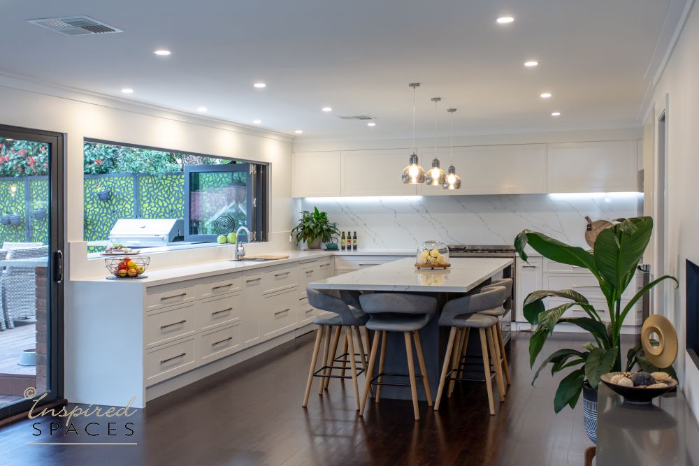
Textured White Kitchens
Plain white kitchens are on the out, and the high gloss finish seen in the early 2000’s is now considered passe. For those who want a white kitchen, texture is the key to creating todays cutting edge look as can be seen in the kitchen we designed for North Homes Selection Showroom. Marble benchtops and splashbacks help to balance the white as does splices of metal. Door and drawer profiles need to have character and enhanced by beautiful handles – Check out this stunning white kitchen by Studio Soleil – demonstrating how to create a white kitchen with texture.

Plain white kitchens are evolving – flat, high-gloss finishes are outdated and no longer on-trend.
Texture is essential in modern white kitchen design, adding depth and interest to the space.
Materials like marble benchtops and splashbacks bring natural variation and luxury, helping balance the all-white palette.
Touches of metal provide contrast and elevate the overall aesthetic.

Timber And Timber Look Laminates
Timber accents are very popular especially as a contrast to dark kitchen cabinetry. Think overhead cupboards, shelves etc. Though all timber kitchens are starting to make a comeback but not the deeply routed door fronts but with more streamlined profiles
From the melamine/laminate range Polytec Prime Oak Woodmatt is very popular due to the deep yellow- brown natural oak colour with grey undertones – pairs perfectly with so many colour palettes. However, the deeper, rich chocolate undertone of Florentine Walnut is quickly becoming a favourite

Tapware
People are embracing the warmth of brass, bronze and gold, a distinct move away from brushed and polished chrome that has been dominant for the last 20 years. As the colour palettes of our homes post covid, move to warmer, more cocooning colours, tapware has adapted to this colour way.

We hope you’ve enjoyed reading our blog on kitchen colour trends. Click here to read up about the pros & cons of L-shaped kitchens.
Kitchen Colour Trends & Choosing the Right Palette FAQ’s for 2025:
1. What are the most popular kitchen colour trends in 2025?
Current kitchen colour trends include:
- Muted greens like olive, sage, and eucalyptus, often paired with brass or bronze tapware.
- Dark and moody tones such as navy, charcoal, and black, balanced with light benchtops.
- Warm earthy browns and reds like Dulux Namadji and Tapestry Beige.
- Textured white kitchens using materials like marble and detailed cabinetry.
- Bold natural stones such as Verde Alpi or Aurora Quartzite as statement pieces.
2. How do I choose the right colour scheme for my kitchen?
Start by considering the mood you want:
- Warm colours (reds, yellows) create energy and warmth.
- Cool colours (greens, blues) offer calmness and freshness. Also think about your kitchen size, natural lighting, and personal style. Use the 60-30-10 rule to balance your palette.
3. What is the 60-30-10 rule in kitchen design?
The 60-30-10 rule helps you create a balanced colour palette:
- 60% Dominant Colour – typically used on cabinets or walls.
- 30% Secondary Colour – benchtops or splashbacks.
- 10% Accent Colour – tapware, bar stools, or decor pieces.
- What colours make a small kitchen look bigger?
Light colours like white, soft beige, or pale grey reflect light and make small kitchens feel more open. Use minimal contrast and keep the palette cohesive. For dramatic effect, small kitchens can also embrace bold colours with good lighting.
5. Are white kitchens still on trend in 2025?
Plain, high-gloss white kitchens are no longer trending. In 2025, textured white kitchens are in style. Add depth with materials like marble, timber, or metal accents, and use detailed door profiles and character-filled handles.

Book a 15-Minute FREE Discovery Call
Need help or advice regarding any residential or commercial design or decorating projects? Get your FREE 15-minute discussion with Robyn!


Leave A Comment Or Ask A Question