We love it each year when the Dulux Colour Forecast is released for the year ahead. Three new and exciting trends to interpret, then to consider how they can be used in upcoming projects.
It’s quite amazing to see how the forecasters have analysed local and global events. They also look at fashion, furniture and product design and then compile all their findings. From this they translate them into colour forecasts and predictions on how they will influence Australian design during the coming year.
“Colour forecasting for interiors is an evolution. While fashion is an important influencer, the shifts in interiors are more subtle and nuanced. The palettes we can expect to see in our homes in 2023 are predominantly warm and nurturing, with nature continuing to be a key driver of trends. Brighter hues continue, however, they are deeper than last year.”
— ANDREA LUCENA-ORR, COLOUR AND COMMUNICATION MANAGER AT DULUX
After a chaotic couple of years, many of us feel an overwhelming desire to live more simply and authentically. In response, the Dulux Colour Forecast 2023 reflects our desire to bond with the environment, or communities and the people we love, with warming, earth-drawn neutrals, natural textures and an array of uplifting brighter hues. Sustainability will also be an important focus in the year ahead. It’s no longer enough that something is beautiful, it needs to earn its place in our home and be gentle on the environment.
So let share with you a brief overview of the Dulux Colour Forecast for 2023. There are three palettes – Connect, Revive and Balance.
Dulux Connect Palette
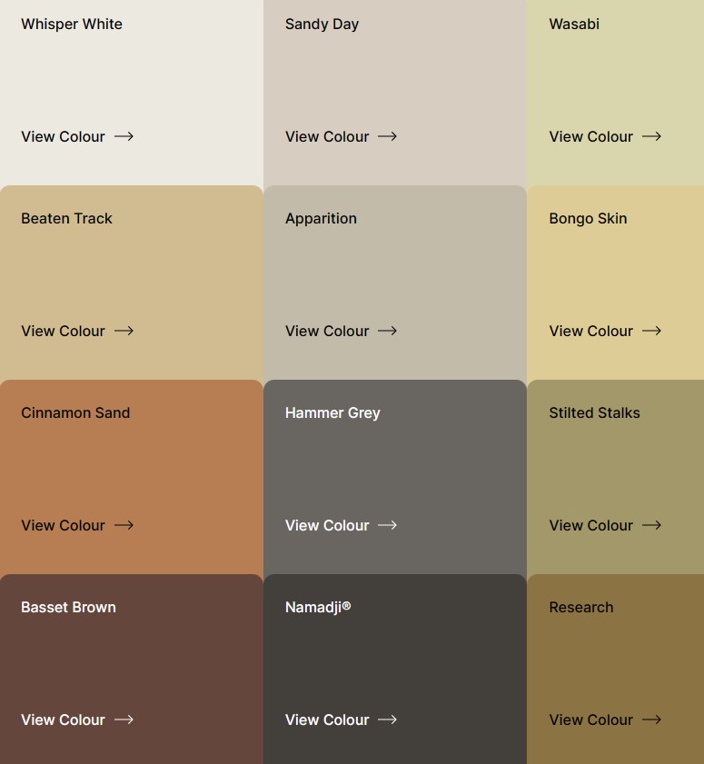
The Connect palette features soft earthy neutrals, naturals, muted greens, and wheat yellows, combined with accents of warm deep brown, grey and charcoal.
A home with a connection to the outdoors has become vital to our wellbeing. Technology has provided us with a new freedom; we no longer need to live in the cities and the suburbs to work – allowing the move to rural settings where we can reconnect with nature. We look for sustainability, authenticity and meaning in the items we choose to connect to and surround ourselves with at home. Décor has a raw beauty featuring imperfections to honour the process of making.
Dulux Colours In Connect
The Connect palette moves through soft arid nature-influenced hues ranging from Stilted Stalks and Wasabi to the cost Beaten Track. The palette is accented with rich colours such as Research and Basset Brown. It also features soft warm neutrals to scheme with, such as Apparation and Sandy Day to work with the earthy palette.
Dulux Revive Palette
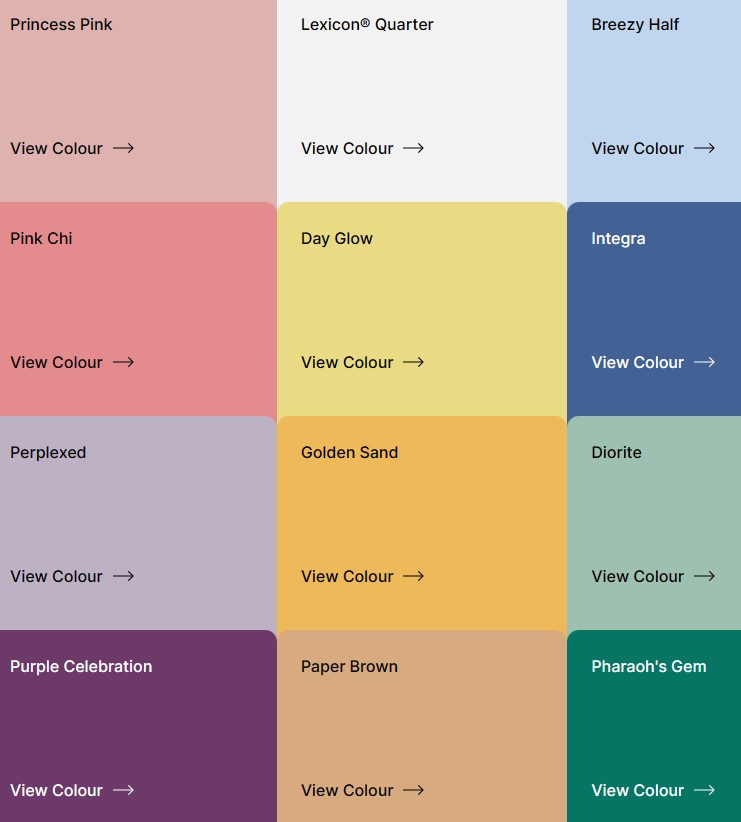
The Revive palette is creative and joyful, featuring soft blue and lilac used alongside vibrant emerald green, warm yellow and accents of playful pink and purple. With a need to feel secure and empowered we unleash our creativity and set ourselves free from regulations.
Our individual style emerges as we reject past constraints, resulting in a joyful collision of colour and pattern. The freedom of the metaverse allows for creative expression while the power of play has the ability to heal.
Revive is a clash of modern and revived styled from the ‘50s, ‘60s, ‘70s and ‘80s. Pattern are graphic, funky, wavy, checkered, pixelated and geometric.
Dulux Colours In Revive
Revive is a vibrant and joyful palette with softer colours such as Breezy Half and Perplexed bring life to a room. Emerging colours such as Diorite and Pharaoh’s Gem add a freshness to the palette while warmth is added with Paper Brown, Golden Sand and Day Glow. The palette works well with Lexicon Quarter, a cool fresh white perfect for modern, open-plan spaces.
Dulux Balance Palette
The Balance palette features delicate pastels, oceanic hues such as soft greens, and deep moody teals and blues. Punctuated with accents of deep garnet and near-black.
With so much uncertainty and loss of control, there is a need to restore the balance and a sense of calm in our lives. In a post-pandemic world, some of us are needing the reassurance of rules and parameters. Beauty that is underpinned by structure reassures us. The allure of the ocean and its untapped potential draws us in. It allows its calming effect to wash over us.
Elegant and refined. The harmonious lines of waves and the movements of the sea inspire colour and pattern in our interiors.
Dulux Colours In Balance
The Balance palette starts with soft pastels influenced with those from a seashell. The subtle pink of Mornington and Porcelain combined with the subtle Pure Blue Half and Green Alabaster Half. Kimberley Sea and Sea Kelp reflect deeper watery hues. Casper White Quarter and Terrace White provide neutral options that work well with the stronger palette colours.
How To Introduce Colour Into Your Home
Andrea Lucena-Orr is the Colour and Communication Manager at Dulux. If you’re thinking about introducing colour into your home, check out some of her tips below:
- To introduce colour, try painting the skirting boards or architraves in your living room, the edge of a door, the back of a bookshelf, a bedhead in your child’s room, or breathe new life into an old lamp base , chair or front door with a coat of paint. You’ll find that colour really makes a house a home – once you get started with paint colours, you’ll never look back!
- Before you start painting, it’s crucial when selecting colours for walls or soft furnishings that you consider other fixtures and fittings in your space that you can’t change easily – it might be carpet, tiles, laminate or stone, and/or curtains and blinds that you will need to ensure work with the new colour(s) chosen.
- For colour surety, simply order A4 stickers or Sample Pots from dulux.com.au in your chosen colour(s) for your space – view these colours in your home’s natural light conditions. Alternatively, Dulux has an online colour advice team and a Colour Design Service if you want a design professional to assist in curating your space
We hope you’ve enjoyed this overview of the Dulux Colour Forecast for 2023. For a more comprehensive look at these three new colour palettes head to the Dulux website by clicking here.
Fun Fact:
Did you know that there are different colour sensing cones in our eyes and that these change over time? For example, Young eyes love the colours with longer waves – such as reds and oranges. While older eyes prefer the colours with the shorter waves – like greens and blues.
A new colour on your walls is the most cost effective and quickest way to update any room.
We would love to help create an inspiring and beautiful colour scheme for your home. So why not get in touch by clicking here to arrange a free 15 minute consultation.
Wishing you all a very Happy New Year!


Leave A Comment Or Ask A Question